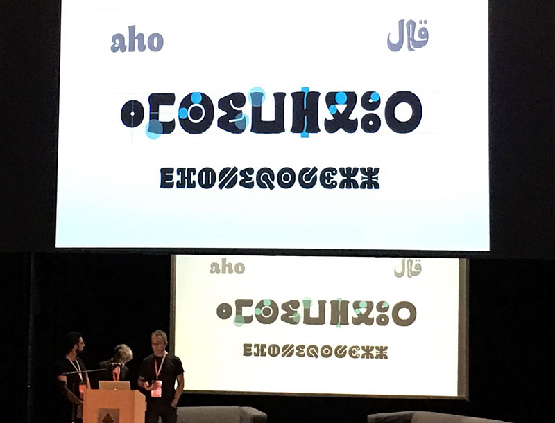
The “Qandus team” on stage at the Academy of Fine Arts in Warsaw. On screen Qandus Tifinagh dark. Image: Mariko Takagi.
Few days after the presentation in Amsterdam Kristyan Sarkis, Laura Meseguer and myself came to the ATypI conference in Warsaw to talk about our experience designing Qandus, one of the type families developed during the Typographic Matchmaking in the Maghrib project. We called the talk “A Typographic Maghribi Trialogue” as a way to underline the intense and continuous exchange among the three cultures and writing traditions –Arabic, Latin and Tifinagh– that this project has called for, but also to recall the necessary respect for each one’s peculiarities and specific features. In my view, our’s was one of the projects that best matched the theme of the conference: convergence.
Maybe because few people knew about the astonishing work of the Moroccan calligrapher Al-Qandusi —on which the core concept of the project is based—, or because most of the assistants saw the Tifinagh alphabet for the first time, or because no-one had seen the latin alphabet speak like an “Andalusian Berber”, who knows! the thing is that the lecture was highly acclaimed. Here it is a glimpse of the feedback we got:
“…the family includes Latin, Maghribi and Tifinagh. It is a very lively design, which is planned to be developed in a variety of weights (so you may want to keep an eye out for it). The collaborative process between these three talented designers seems to have been such a fruitful experience, their presentation was heartwarming to watch.” in Alphabettes
“Laura Meseguer, Kristyan Sarkis and Juan Luis Blanco’s talk about the Typographic Matchmaking in the Maghreb was definitely a peak moment. For me it was a unique presentation, a magical moment. The project consisted of designing a typographic family with the three main writing systems of Maghreb and Al-Andalus: Latin, Arabic and Tifinagh. The result is Qandus, a type family that conveys a historical approach and respect but without the dust of nostalgia.” in Alphabettes
It seems we created high expectations, which encourages us to keep on working and collaborating in order to extend the project beyond the three weights designed so far. The final family will comprise nine styles in three weights, each one showcasing specific features, ranging from solid to fluid constructions on the one hand, and from written to drawn procedures on the other. Those who attended ATypI 2016 in Warsaw had already a glimpse of the complexity involved. I hope we can show the results soon so, as Alice said, keep an eye out for it!


